How We Updated Our Onboarding Process and Got More Users
The Challenge
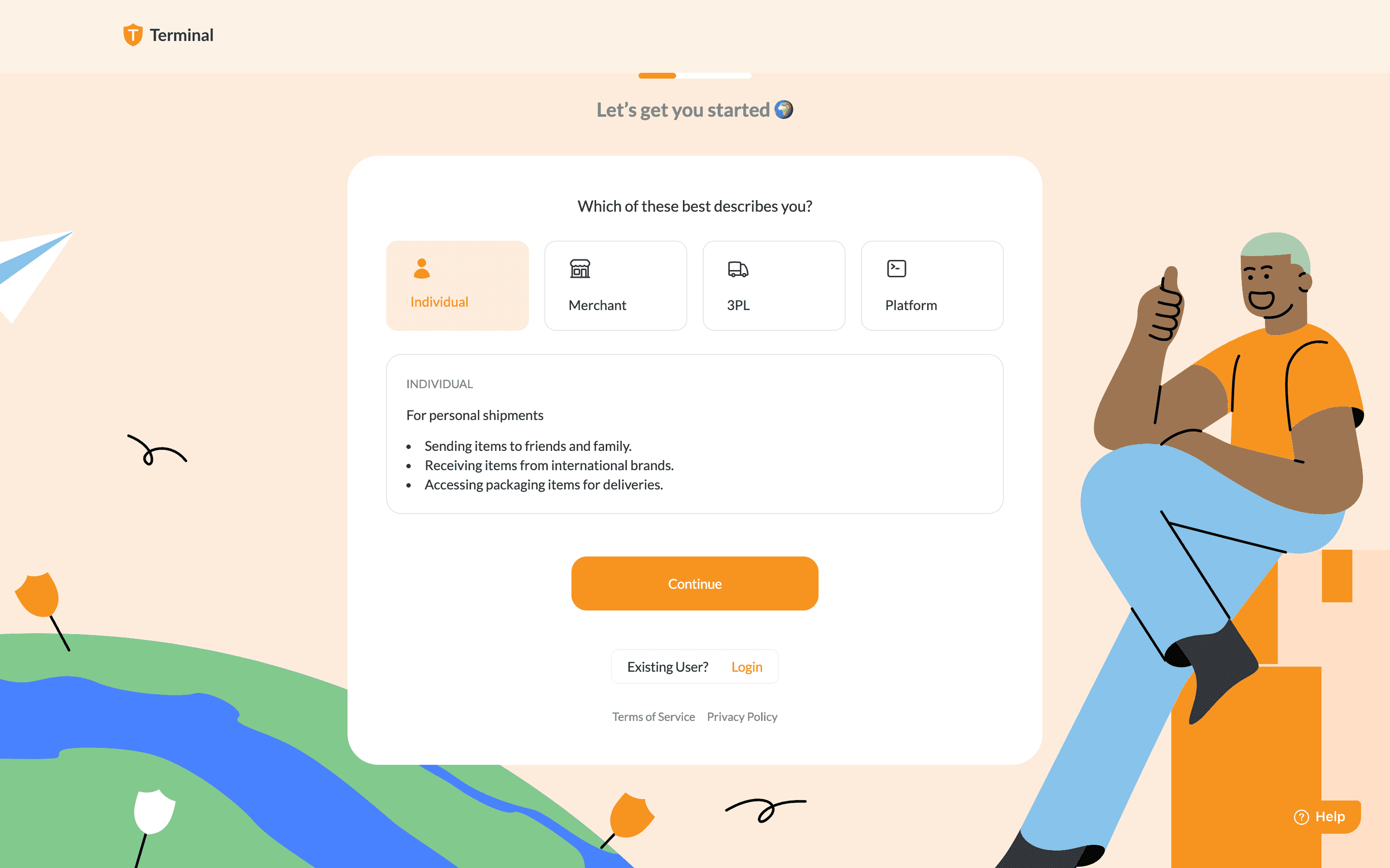
Terminal Africa faced a significant issue with user onboarding: a number of users were inadvertently signing up with the incorrect account type. We have 4 account types - Individual, Merchant, 3PL, Platform. On the dashboard, users cannot change account type after signup. This led to confusion, frustration, and unnecessary backend work to rectify the issue.
The primary causes of the problem were:
Default Selection: The "Individual" account type was pre-selected, leading many users to overlook other options.
Incorrect Order of Options: The most valuable account type (3PL) was not the first option.
Lack of Clear Visual Cues: The design did not effectively guide users to the correct account type.
Lack of Flexibility: Once users signed up, they were unable to change their account type within the dashboard.
The old onboarding screen with preselected account type:

The Solution
This case study highlights the importance of careful design and testing in ensuring a positive user experience. To address these issues, we implemented the following UX design improvements:
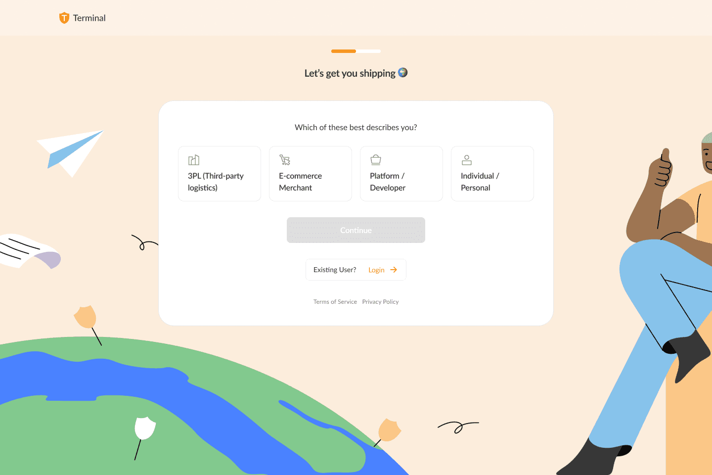
Reordered Account Types: I prioritized the most valuable account type (3PL) by placing it at the top of the list. This made it more visible and easier for users to select. According to the Serial Position Effect, important items in a list should be placed at the beginning and end of the list so that users find it easy to remember. Also, since we get the most value from 3PLs, they are the most important and the closer that option is to users, the easier it is to onboard them. Therefore, 3PL should be the first account type to appear. That is why I rearranged the account types from:
Individual —> Merchant —> 3PL —> Platform to:
3PL —> Merchant —> Platform —> Individual.Removed Default Selection: We removed the pre-selected account type to encourage users to make a conscious decision.
Disabled "Continue" Button: We disabled the "Continue" button until a user selected an account type, ensuring that they made a deliberate choice.
Consistent Visual Design: We maintained a consistent visual style throughout the onboarding process, using a clear and intuitive design language.
Clear and Concise Language: We used simple and direct language to explain the differences between account types.
Visual Cues: We employed visual cues, such as color coding and icons, to differentiate between account types.
Mobile-Responsive Design: We optimized the onboarding process for mobile devices as well, ensuring a seamless experience across all platforms.
User Testing: We conducted usability tests to gather feedback on the redesigned onboarding flow and identify any potential issues.
The new onboarding screen with rearranged account types, no preselected option and a disabled button:

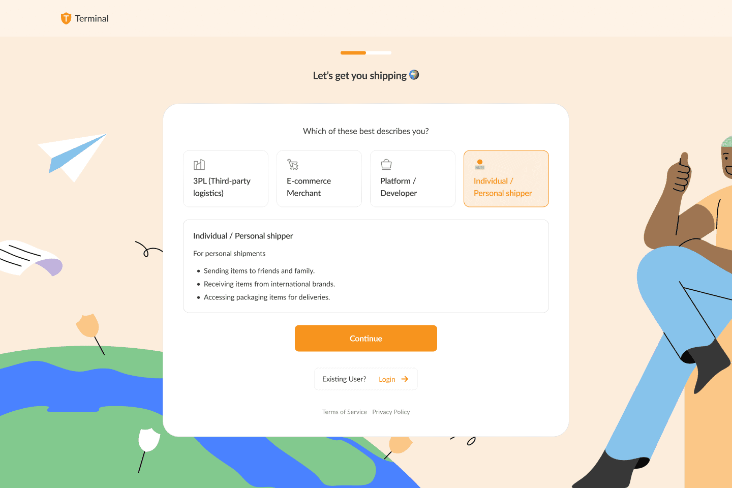
The new onboarding screen with a selected account type, details of the account type and an active button:

Results
The redesigned onboarding process resulted in a significant reduction in users selecting the wrong account type. Key improvements included:
Increased User Satisfaction: Users found the new onboarding process to be more intuitive and less confusing.
Reduce Incorrect Sign-ups: Significantly decreased the number of users signing up with the wrong account type.
Improve User Experience: Created a more intuitive and user-friendly onboarding process.
Enhance Brand Reputation: Delivered a positive user experience, contributing to a stronger brand reputation.
Reduced Support Tickets: Fewer users required assistance with account type changes, leading to reduced support costs.
Improved Conversion Rates: The streamlined process led to higher conversion rates, as users were able to complete the onboarding process more quickly and efficiently.
Lessons Learned
Prioritize User Research: Conduct thorough user research to understand user needs and behaviors.
Keep It Simple: Avoid unnecessary complexity and clutter in the design.
Test and Iterate: Continuously test and refine the design to ensure optimal user experience.
Pay Attention to Detail: Small details, such as clear labeling and visual cues, can have a significant impact on user experience.
In conclusion, focusing on user needs and implementing evidence-based design principles, we were able to create a more effective and user-friendly onboarding experience.
Important: Users still are not able to change their account type themselves on the Terminal dashboard. This change would consume many resources and the leadership thought it was best to postpone this update for the future.
